
The use of the reviews and star ratings are not entirely typical for a DVD cover, which makes this cover subvert the stereotype for covers. The title is clearly in the centre of the cover and the use of the iconography makes it clear to understand the genre of the film. The pull out quote at the bottom is interesting as this is also quite unusual however I think the reason for this being there would be due to the film being quite different, in terms of content and context as it involves the political ideologies of Plan B and the harsh reality of the subject matter. The protagonist is also central in the cover and due to him being well known, it helps to identify the film and also the genre of the film, through the iconography of the weapon and the costume. The use of the mise-en-scene also helps to understand the genre of the film as the block dawning over the protagonist creates the sort of impression that the estate is towering over them and they're trapped within this society and cannot get out of their stereotypes and labels. Also this is reinforced by the fact that the protagonist is almost holding the title in his arms, and if the title metaphorically represents the tower block and the estate, it may show how he is trying to take a hold on his society and trying to overcome these negative stereotypes but due to the tower blocks dawning over him, it is not possible to do so.
The font is continuous across all media platforms, which highlights ill Manors as a brand. The way that it has been centred and has this quite 'block-ish' format, reinforces the idea of the council estate or the council 'block,' which makes the brand of ill Manors easily recognisable due to this particular format. Also the use of Plan B as a brand is clearly noticable and this is the USP of the film, the thing that makes it different from all other British urban drama films. The point of making this part so explicit sells the film in itself as a brand. Also, the main protagonist Riz Ahmed, is clearly featured on the front of this cover, which makes it clear to the audience that he is featured and can automatically link him to the genre due to the iconography presented.
The use of synergy is clear as there is a cross promotion between the DVD and soundtrack as there would be information about the soundtrack on the back of the cover, which therefore creates synergy between the two. Also, the DVD release date would have been revealed through a broadcast platform, which would have helped promote the release of the DVD so more of a broadened audience would hear about it and know about it; creating more exposure.
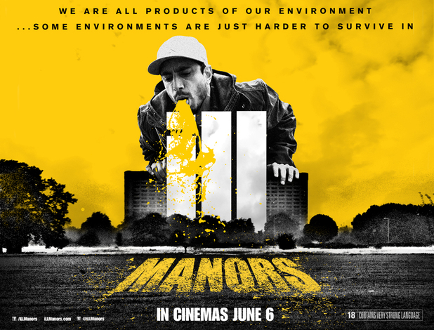
I think this print would be on a billboard or a cinema poster. The typical conventions of these are present as you would not expect paragraphs of writing; simply the title, tag line and release date. The use of having such a minimal amount of writing makes it explicit to the audience about what the film is and when it is releasing. The use of the bright eye catching yellow makes it easy to recognise, therefore I would expect this to be a billboard poster as when drivers are driving past they are more likely to stop and look. The use of the minimal amount of writing also makes it easy to not distract a driver as they can easily identify that the film is named ill Manors and releasing on June 6th. The striking image is also very eye catching and the use of the colour scheme yellow and black is quite urban appearing as it seems quite raw and urban, through the sort of silhouette design.
The use of the 'ill' being written in the same format and same font as the other print designs makes it easily identifiable as a brand. The tag line of course is something that would be consistent throughout all print platforms, therefore makes it an easily recognisable tag line to link to the film. Again, the protagonist Riz Ahmed is presented, which again links directly to the film. The interesting thing about this billboard poster is that there is no direct link to Plan B himself, which is interesting but it is also expected as there would be further writing on the poster, which is not necessary on a billboard poster.
Riz Ahmed creates the synergy within himself as he appears throughout the print platforms, which makes it easily identifiable to recognise ill Manors; also due to the same costume being worn in all posters, which makes it again recognisable. The cinema release date would again have been broadcasted and Plan B broadcasts this Radio 1 for example, which creates synergy between the broadcast and print platform.

Due to the large amount of writing, I would argue that this would most probably either be a double page spread within a magazine or a poster. The use of all the actors being presented makes it clear that these actors are featured and it also makes the poster seem more full and bright. Of course, Riz Ahmed is featured central, again creating that link in the film. The use of the pull out quote and star rating makes it clear to recognise that this film is highly regarded as a good film and the use of 'Plan B present' being featured within, again highlights the unique selling point of the film. The colour scheme is quite similar to the previous prints as there's these raw colours. The use of the orange could connote the heat within the society. The facial expressions are interesting within this poster too as the female characters are quite worried and sad, whilst the two male characters wearing caps are elated. This gives the audience a sense of the characters and what they are like, making the audience understand part of the characters before watching the film.
The use of the main protagonist in the centre of the poster makes it easily identifiable and also the font and formatting of the title again presents the brand in a recognisable way. The fact that it says 'featuring the brilliant new soundtrack composed by Plan B' shows the director in all his greatness.
The use of the words 'featuring the brilliant new soundtrack composed by Plan B,' creates clear synergy between the soundtrack and the film. The cross promotion between the two help to interlock and sell one another as music fans will be interested in the soundtrack and will therefore notice the film and vice versa.
No comments:
Post a Comment